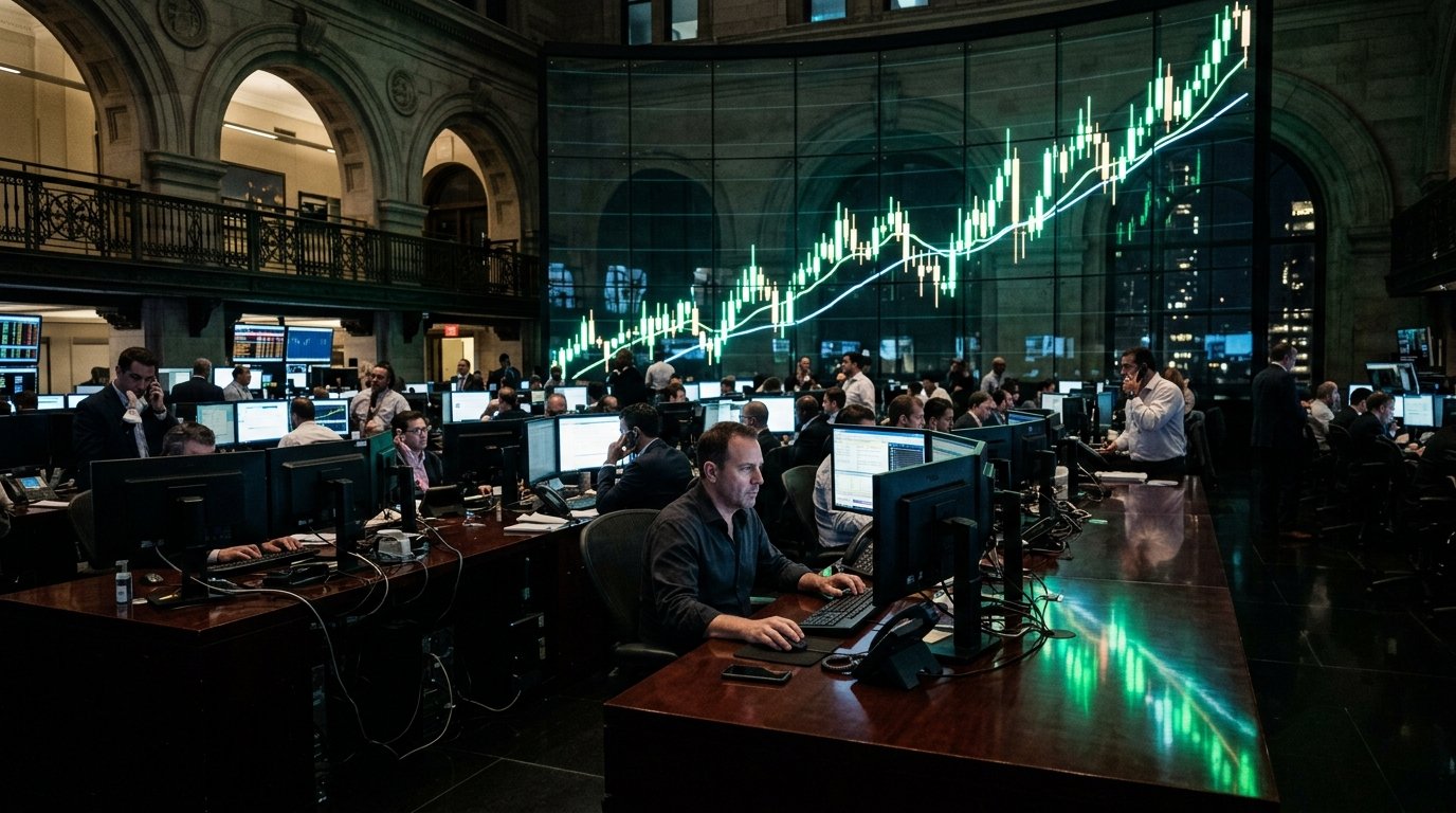
One chart. 120 years. And honestly once you actually look at it properly you start seeing things that no financial advisor ever quite explains in a meeting. The stock market looks terrifying up close. Zoom out far enough and the whole story changes completely.
It Always Went Up Eventually

Every single crash on that chart, every red period, every moment where people were genuinely convinced it was over for good. All of it recovered. Not sometimes. Every time. The chart does not lie about this and that one fact alone changes how you should probably be thinking about markets.
The Crashes Look Tiny From Far Away

1929 looks catastrophic when you read about it. On a 120 year chart it is a blip before one of the longest runs in history. 2008 same thing. Brutal to live through, barely visible from a distance. Time does something very specific to losses that nothing else can replicate.
Wars Did Not Stop It

Two world wars. Korea. Vietnam. Gulf War. Every time the market had every reason to collapse permanently and every time it did not. Companies kept running, people kept spending, economies kept rebuilding. The chart carries all of that history quietly inside it.
Technology Changed the Slope

Look at the chart somewhere around the 1980s and notice the angle shifts. Personal computers, then internet, then smartphones. Each wave pushed the line steeper than the one before it. Innovation does not just create companies. It reprices the entire market upward over time.
The 2000s Were a Lost Decade

Start in January 2000, end in December 2009. Flat. Two massive crashes inside ten years and investors who went in at the peak basically broke even at best. The chart shows this clearly. Long term works. Specific timing matters more than people admit out loud.
Inflation Is Hidden in the Numbers

The raw chart looks impressive. Adjust it for inflation and the real returns are still strong but noticeably more modest. A dollar in 1900 and a dollar today are not the same conversation. The chart looks better than reality slightly because of this and it is worth knowing.
Dividends Are the Secret

Price alone undersells the actual return. Dividends reinvested over decades turn a good chart into a genuinely extraordinary one. Most versions of this chart do not show dividends visually and that missing piece changes the math significantly in your favor.
The Line Does Not Care About News

Wars, assassinations, elections, scandals, pandemics. Every major event in 120 years of American history is somewhere on that chart. Almost none of them permanently altered the direction. The line kept going up not because nothing bad happened but because something in the underlying engine kept running anyway.
What the Chart Cannot Show

The people who sold at the bottom and never got back in. The ones who sat in cash waiting for the perfect moment that never came. The chart shows what the market did. It does not show what investors actually experienced and those two things are very different stories sitting on the same page.